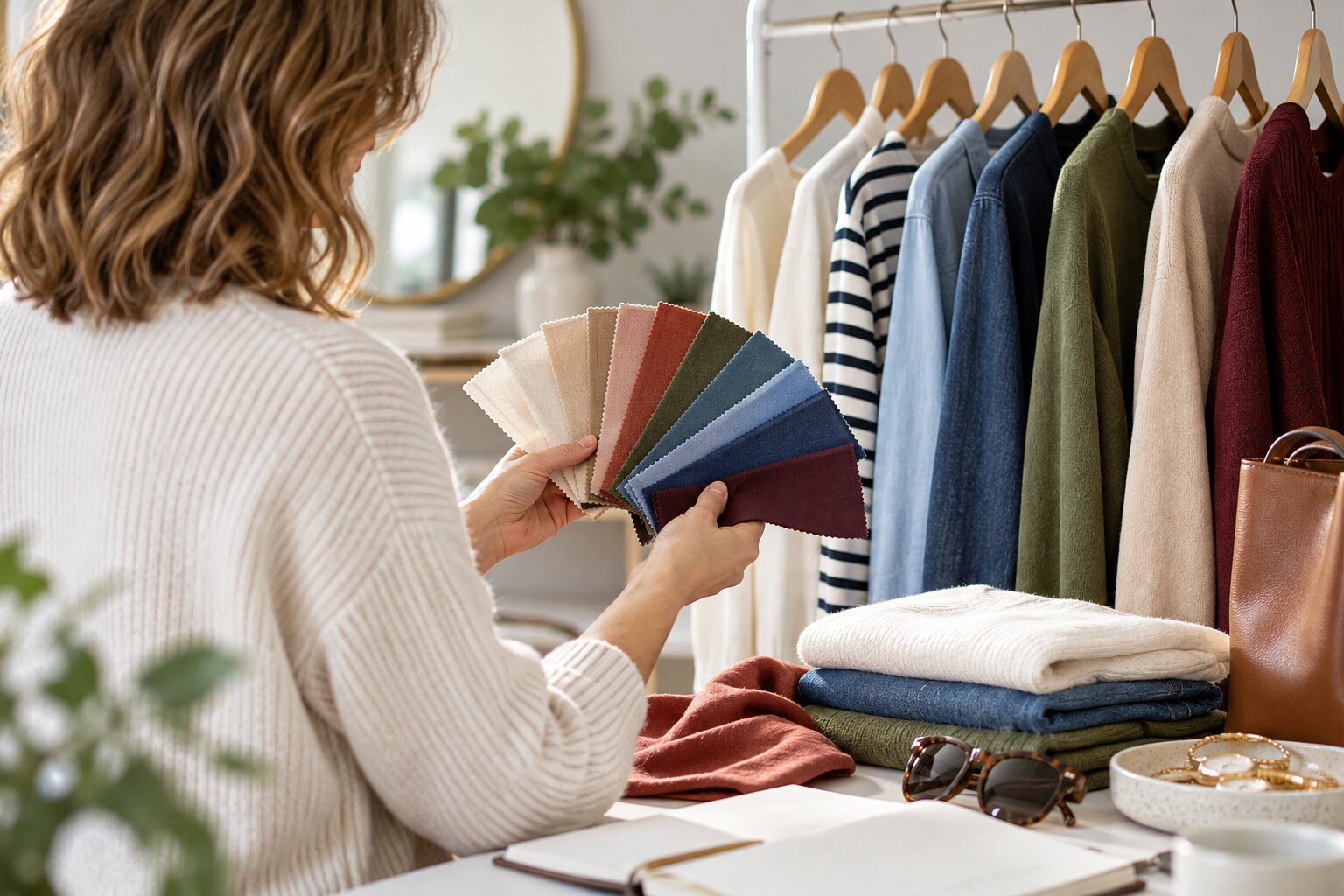
Choosing colours for your wardrobe can feel surprisingly difficult. A shop may contain dozens of blues, greens and browns, yet only a few seem to work with the clothes you already own. A colour that looks beautiful on its hanger may feel unfamiliar when you put it on, while a shade described as universally flattering may do very little for you.
The difficulty partly comes from the way colour is discussed. Fashion advice often presents colours as fixed categories: warm or cool, flattering or unflattering, safe or difficult. Real colour is more complicated. The appearance of a shade changes according to the fabric, lighting and colours surrounding it.
Josef Albers based his influential teaching on this instability. Rather than treating colour as a set of facts to memorise, he encouraged students to observe how colours changed through interaction and context. A colour placed beside black may appear brighter; the same colour beside white may appear darker or more subdued.
This is good news for beginners. You do not need to discover one perfect palette and follow it forever. You can learn by comparing clothes, testing combinations and gradually identifying the colours that are easiest and most enjoyable for you to wear.
Start With the Colours You Already Wear
Before looking at colour wheels or personal-colour systems, examine your current wardrobe.
Pull out the clothes you wear most often and place them together. Do not include everything you own; concentrate on the pieces you regularly choose. Look for repeated colours.
You may find that your wardrobe is already built around:
- navy and cream;
- black, grey and burgundy;
- denim blue, olive and brown;
- camel, ivory and rust;
- white, cobalt and black.
These combinations provide a more useful starting point than a generic list of fashionable colours. They show what you already feel comfortable wearing and which shades are supported by your shoes, coats and accessories.
Next, look at the clothes you rarely wear. Is colour part of the problem? Perhaps a bright green top has no suitable bottom, or a pale beige jacket makes all your existing trousers look too dark. The colour itself may be attractive, but it has not been connected to the rest of your wardrobe.
This simple exercise separates two questions that are often confused:
- Do I like this colour?
- Can I use this colour easily?
A colour can pass the first test and fail the second. That does not mean you must avoid it, but it may require a more deliberate plan.
Learn the Three Basic Qualities of Colour
You do not need detailed colour theory to dress well. Three basic qualities are enough to explain most combinations.
Hue
Hue is the main colour family: red, orange, yellow, green, blue, purple and the colours between them.
When people ask whether two colours match, they usually focus on hue. They may wonder whether blue works with green or whether pink can be worn with red.
Hue matters, but it does not provide the whole answer. A muted sage green behaves very differently from vivid lime, although both are green.
Value
Value describes how light or dark a colour is.
Pale blue and navy share a hue family but create very different levels of contrast. Pale blue with cream produces a soft, low-contrast combination. Pale blue with black creates a clearer division.
Value is especially helpful when combining neutrals. Cream, camel and chocolate work as a progression from light to dark. The same is true of silver, mid-grey and charcoal.
When an outfit looks flat, adding a noticeably lighter or darker element can create definition. When an outfit feels harsh or fragmented, reducing the value contrast may make it calmer.
Saturation
Saturation describes how bright, intense or muted a colour appears.
Cobalt is more saturated than faded denim blue. Bright red is more saturated than dusty rose. Emerald is more saturated than sage.
Colours with similar saturation often combine comfortably. Muted olive, soft rust and oatmeal appear related because they are all relatively subdued. Cobalt, vivid orange and bright white form a more energetic palette.
When one part of an outfit feels disconnected, compare its saturation with everything around it. A very bright top among several muted garments will naturally become the focus. That may be exactly what you want, but it should look intentional.
Build a Foundation of Useful Neutrals
Neutrals make colour easier because they connect with a wide range of shades.
Common wardrobe neutrals include:
- black;
- white;
- cream;
- grey;
- navy;
- brown;
- camel;
- khaki;
- denim blue.
You do not need all of them. In fact, choosing a smaller group of compatible neutrals usually makes a wardrobe easier to coordinate.
Someone who wears warm, earthy colours might build around cream, camel, chocolate and olive. Someone who prefers cooler combinations might choose white, navy, charcoal and black.
Look particularly at the colours of your most expensive or frequently worn items:
- coats;
- shoes;
- work trousers;
- bags;
- jackets;
- everyday jeans.
These garments influence many outfits, so new colours should work with at least some of them.
Not all neutrals combine effortlessly. A yellow-toned cream may look awkward beside a very cool blue-grey. A faded brown-black may not sit cleanly beside a crisp black. Compare them in natural light and decide whether the difference creates attractive contrast or resembles an unsuccessful match.
Add One Colour at a Time
A wardrobe does not need to become colourful overnight.
Choose one colour that appeals to you and test it against your existing neutrals. This is easier than buying several new colours and trying to make them work simultaneously.
Suppose your foundation is navy, cream and denim. You might add:
- burgundy for richness;
- pale blue for a tonal palette;
- rust for warm contrast;
- green for a natural, relaxed combination;
- pink for a fresher accent.
Start with an accessory, inexpensive top or garment you know you will wear. A scarf, T-shirt, knit or bag allows you to test a colour without reorganising the entire wardrobe.
Create at least three outfits before buying. Be specific:
- burgundy knit with dark jeans and brown boots;
- burgundy top with cream trousers and loafers;
- burgundy scarf with a navy coat and denim.
When you cannot picture several outfits, the new colour may require more supporting purchases than expected.
Use Nature and Prints as Ready-Made Palettes
Nature offers familiar colour combinations: green with brown, sand with blue, rust with olive, or grey with soft pink. These combinations feel comfortable partly because we are accustomed to seeing them together.
Printed garments can perform the same function. A floral blouse, checked coat or patterned scarf already contains a group of colours selected to coexist.
Choose one colour from the pattern for a larger garment and another for an accessory. A skirt containing navy, cream, green and burgundy might be worn with a cream knit and burgundy shoes.
Avoid matching every colour within the print. That can make an outfit feel overly arranged. One or two references are enough.
Prints are particularly helpful when introducing a combination you would not otherwise consider. If a pattern contains both orange and pink, it provides a visual bridge between them.
Understand Simple Colour Relationships
A colour wheel can suggest combinations, but it should provide ideas rather than rules.
Monochromatic Colours
A monochromatic outfit uses one colour family.
You might combine pale blue, denim and navy, or wear cream, camel and chocolate. The shades do not need to match exactly.
To keep the outfit interesting, vary lightness and texture. A navy knit, dark denim and polished navy leather remain distinct because each surface reacts differently to light.
Analogous Colours
Analogous colours sit near one another on a traditional colour wheel.
Examples include:
- blue and green;
- red and pink;
- orange and yellow;
- blue and purple.
These pairings often create a blended effect because the colours share visual qualities. Teal with navy or rust with mustard can feel coordinated without appearing overly matched.
Complementary Colours
Complementary colours sit opposite one another on a traditional colour wheel.
Examples include red and green, blue and orange, and yellow and purple. These combinations create stronger contrast. Tate’s description of Henri Matisse’s The Snail notes his use of red with green, orange with blue and yellow with mauve to create a vibrant result.
In clothing, you do not have to use complementary colours in equal amounts. An olive outfit with a burgundy bag is a quieter interpretation of red and green. A navy dress with orange earrings uses blue and orange without dividing the outfit into two bright sections.
When a complementary combination feels too intense:
- mute one colour;
- make one much darker;
- reduce one to an accent;
- add a neutral;
- vary the fabrics.
Decide How Much Contrast You Enjoy
Some people feel most comfortable in soft, closely related colours. Others prefer clear contrast.
A low-contrast outfit might include stone trousers, an oatmeal knit and tan shoes. A high-contrast outfit might combine black trousers, a white shirt and a red coat.
Neither approach is more sophisticated. They simply create different effects.
Look at photographs of outfits you have enjoyed wearing. Do you repeatedly choose:
- light colours together;
- dark colours together;
- one bright colour against neutrals;
- black and white;
- tonal shades;
- several strong colours?
Your answers reveal your preferred contrast level.
This can be more useful than deciding whether you are permitted to wear a particular colour. You may like green but prefer it in muted olive rather than vivid emerald because olive fits your normal level of contrast.
Think About Warm and Cool Colours
Colours are often described as warm or cool.
Warm colours generally lean towards red, orange or yellow. Cool colours tend towards blue, green or purple. Neutrals also have temperature: camel usually feels warmer than charcoal, while cream is often warmer than bright white.
You can mix warm and cool colours. Blue with rust, grey with mustard and camel with cobalt all rely on temperature contrast.
Temperature becomes most noticeable when shades are very similar. A cool pink-beige top may look slightly disconnected from warm camel trousers, even though both appear neutral. A yellow-toned cream may not match a stark blue-white.
When two garments seem almost right but not quite, compare their undertones near a window. You can then:
- choose a clearer contrast;
- repeat both temperatures elsewhere;
- add a pattern containing both;
- replace one shade with a more neutral alternative.
Do not worry about correctly naming every undertone. You only need to observe whether the garments appear connected.
Consider Colours Near Your Face
The colours worn closest to the face can affect how you perceive your complexion, eyes and hair.
Some shades may make you feel brighter or more defined, while others may make you feel tired or washed out. This is partly personal colouring and partly preference, lighting, contrast and fabric.
Test colours in natural daylight without relying entirely on a shop mirror. Hold two versions of a similar colour near your face and compare them. Perhaps deep teal feels better than pale mint, or ivory feels softer than optic white.
Do not turn this into a search for one permanently correct palette. Hair colour, tanning, make-up, glasses and personal taste can change the result.
When you love a colour but dislike it near your face, wear it:
- below the waist;
- as a bag or shoe;
- within a print;
- beneath a preferred jacket;
- with a lower neckline;
- separated from the face by a scarf or collar.
A personal-colour system should expand your understanding, not prohibit clothes you enjoy.
Be Sceptical of Colour Stereotypes
Colours carry cultural associations, but those meanings are not fixed.
The Museum at FIT’s exhibition on pink examined how the colour’s significance changed across time and place. Pink was not always treated as feminine, and its associations have included luxury, prettiness, vulgarity, androgyny and political expression.
Similar caution should be applied to claims that particular colours automatically communicate confidence, trust, creativity or authority. Context matters. A bright red evening dress communicates something different from a red waterproof coat or red trainers.
Choose colours because they work with your clothes, life and preferences rather than because a simplified psychology chart assigns them a personality.
Treat Denim as a Colour
Denim is often treated as invisible, but its wash changes the palette.
Pale blue denim is lighter and usually more casual than dark indigo. Black denim can be crisp or faded. Vintage washes may contain grey, green or warm undertones.
A rust jumper will look different with pale blue jeans, dark indigo and black denim. The same applies to footwear and outerwear.
Our guide to using denim in a capsule wardrobe explains how different washes and cuts affect compatibility. When assembling an outfit, count denim as one of the colours rather than assuming that every pair of jeans behaves like the same neutral.
Learn From Difficult Colour Combinations
Few colour pairings are universally wrong.
Navy and black, black and brown, red and pink, blue and green, purple and yellow, or mixed metallics can all work. Difficult combinations usually need adjustment rather than prohibition.
Our guide to whether some colours should be worn together examines these supposedly clashing pairings in more detail. The solution often involves changing:
- the proportion;
- the lightness;
- the saturation;
- the fabric;
- the surrounding neutral;
- the placement of each colour.
If green trousers and a purple top feel overwhelming, try a muted olive with deep aubergine, add a cream jacket or use purple only in a patterned scarf.
The unsuccessful attempt still teaches you something. It may reveal that you prefer lower saturation, smaller accents or stronger neutral foundations.
Create a Personal Wardrobe Palette
Once you have observed your existing clothes, build a simple palette.
Choose:
- two or three main neutrals;
- two colours you wear confidently;
- one or two optional accent colours.
An example might be:
- navy, cream and denim as neutrals;
- olive and burgundy as regular colours;
- rust and pale pink as accents.
This is not a shopping list or a permanent restriction. It is a reference that makes future decisions easier.
Keep a photograph of the palette on your phone. You might create it from garments laid on a bed, colour swatches, magazine cuttings or a digital collage.
When shopping, compare a possible purchase with the palette. It does not have to match everything, but you should understand its role.
Make Colour More Accessible
Not everybody distinguishes colours in the same way.
Colour Blind Awareness estimates that colour-vision deficiency affects approximately one in twelve men and one in two hundred women, amounting to about three million people in the UK.
People with colour-vision differences may rely more heavily on value, pattern, texture, labelling and familiar combinations. These are useful strategies for any beginner.
You can:
- photograph successful outfits;
- organise clothes by known combinations;
- label similar dark colours;
- compare lightness rather than hue alone;
- use texture and pattern to distinguish garments;
- ask for a second opinion when an exact match matters.
Good personal style does not depend on identifying every colour name. It depends on making combinations you can use confidently.
Common Beginner Mistakes
Buying an Isolated Colour
A beautiful garment is not useful when it has no partners. Identify three outfits before purchasing.
Introducing Too Many New Colours
Build gradually. One new colour is easier to integrate and assess than four.
Ignoring Coats and Shoes
Plan the complete outfit. Outerwear and footwear often occupy large visual areas.
Matching Everything Exactly
Related colours usually look more natural than a perfectly matched set of shoes, belt and bag.
Treating All Neutrals as Identical
Compare undertones and lightness in daylight.
Following a Palette You Do Not Enjoy
A technically coordinated wardrobe is not successful when it feels unlike you.
A Simple Colour-Choosing Routine
When considering a new colour, ask:
- Do I genuinely like it?
- Does it work with my main neutrals?
- Can I create three complete outfits?
- Do I prefer it near my face or elsewhere?
- Is its intensity compatible with my wardrobe?
- Does it work with my coat and shoes?
- Would a lighter, darker or softer version be easier?
Then test the colour in natural light.
Readers who have developed their own practical approach to colour and personal style can find details through Louie Boutique’s fashion write for us section.
Choosing Colours Should Become Easier, Not More Restrictive
Learning about colour should give you more options.
Begin with what you already wear. Identify your main neutrals, notice your preferred level of contrast and add new colours gradually. Compare hue, value and saturation, but use those ideas to solve problems rather than impose rigid rules.
Let prints suggest combinations, use accessories for experiments and pay attention to the colours of denim, footwear and outerwear. When a colour feels difficult, try another depth, intensity or placement before rejecting the entire family.
Most importantly, trust repeated experience. The outfits you enjoy wearing provide better evidence than a universal list of flattering shades.
Colour confidence does not mean knowing every theory. It means being able to look at a garment, understand how it might fit into your wardrobe and choose a combination that feels coherent, practical and personal.
Sources and Research Notes
The Josef and Anni Albers Foundation, Interaction of Color, on understanding colour through observation, experimentation and context.
Tate, information accompanying Henri Matisse’s The Snail, on the artist’s use of complementary red and green, orange and blue, and yellow and mauve.
The Museum at the Fashion Institute of Technology, Pink: The History of a Punk, Pretty, Powerful Color, on the changing cultural meanings of pink across different periods, places and forms of dress.
Colour Blind Awareness, About Colour Blindness, for estimates concerning colour-vision deficiency among men, women and the UK population.