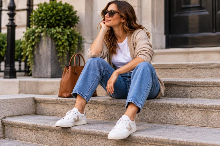
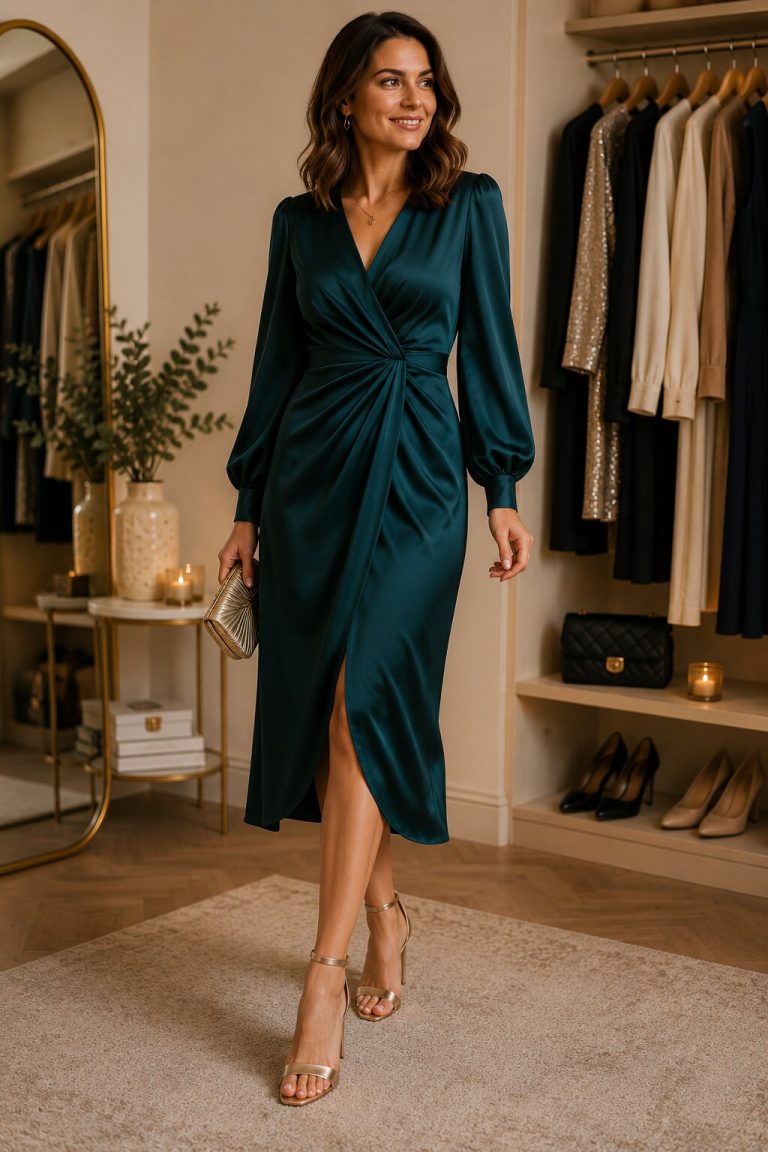
Colour is often the first thing people notice about an outfit, yet it is also one of the areas where fashion advice becomes unnecessarily complicated. Colour wheels, seasonal palettes, lists of forbidden combinations and rules about warm and cool tones can make getting dressed feel like a technical exercise.
In practice, successful colour matching is usually less about finding a perfect formula and more about creating a clear relationship between the colours you are wearing. Two unusual shades can look excellent together when their intensity, proportion and context are considered. Two supposedly safe neutrals can look awkward when their undertones, textures or levels of formality do not connect.
Josef Albers built his influential teaching around the idea that colour is understood through context. A colour can appear lighter, darker, brighter or duller depending on what surrounds it. That principle matters greatly in clothing because colours are rarely seen alone: they sit beside skin, hair, denim, shoes, outerwear, metal hardware and other fabrics.
You do not need formal art training to match clothes well. You need a few practical ways to compare colours, understand their roles and recognise when an outfit needs more connection or less competition.
Begin With the Colour You Most Want to Wear
When building an outfit, start with one clear colour decision.
This might be the garment you most want to wear, such as a green jacket, rust-coloured trousers or a printed skirt. It may instead be a practical item that cannot easily be changed, such as a navy coat, brown boots or a work uniform.
Once the starting colour is clear, the remaining choices become supporting decisions. You are no longer asking which colours work in the abstract. You are asking what will work with this particular shade, fabric and amount of colour.
Suppose the starting point is an olive-green overshirt. You might combine it with:
- cream and tan for a soft, natural palette;
- black and white for greater contrast;
- burgundy for a rich autumnal effect;
- pale blue denim for a relaxed combination;
- darker green and brown for a tonal outfit.
Each is valid because it creates a different relationship. The question is which one suits your taste, destination and existing wardrobe.
This approach also prevents the common mistake of trying to introduce several unrelated statement colours at once. When one colour leads, the rest of the outfit can either support it or provide a deliberate contrast.
Understand Hue, Value and Saturation
Most outfit-colour problems become easier to diagnose when colour is divided into three qualities.
Hue
Hue is the basic colour family: red, blue, green, yellow, purple, orange and the shades between them.
People often focus entirely on hue when asking whether colours match. They may wonder whether green works with blue or whether pink works with red. However, hue is only one part of the result.
Value
Value describes how light or dark a colour is.
Pale blue and navy belong to the same broad hue family but create very different effects. A pale blue shirt beside white trousers produces low contrast, while the same shirt with black trousers creates much stronger contrast.
Value is particularly useful when combining neutrals. Charcoal, mid-grey and pale silver form a tonal group because they vary mainly in lightness. Cream, camel and chocolate can create a similar progression among warm neutrals.
When an outfit looks visually flat, it may need a greater difference in value. When it feels harsh or divided, reducing the light-dark contrast may help.
Saturation
Saturation describes how intense, pure or muted a colour appears.
Emerald green is more saturated than sage. Bright red is more saturated than dusty rose. Cobalt blue is more saturated than faded denim.
Colours with similar levels of saturation often combine easily. Soft olive, muted rust and cream feel related because none is extremely bright. Cobalt, vivid orange and strong white create a more energetic palette because the colours are much clearer and more intense.
A colour combination that seems wrong may simply contain one shade that is much brighter than everything around it. You can either make that colour the obvious focal point or replace it with a more muted version.
Use Neutrals as Connectors
Neutrals are useful because they allow stronger colours to coexist without competing for equal attention.
Common clothing neutrals include:
- black;
- white;
- cream;
- grey;
- navy;
- brown;
- camel;
- khaki;
- many shades of denim.
A neutral does not have to disappear. A camel coat or deep navy suit can lead an outfit. The term simply describes a colour that combines readily with a broad range of other shades.
When two colours feel difficult together, insert a neutral between them. A green jacket and purple top may feel intense when worn directly together, but dark jeans, a cream layer or a black accessory can give the eye somewhere quieter to rest.
Neutrals can also repeat one quality of the stronger colours. A warm tan works naturally with rust and mustard. Charcoal connects well with cool blue and purple. Cream may soften warm colours more gently than bright white.
Do not assume all neutrals automatically match. A very cool blue-grey can look disconnected from a yellow-toned beige. They may still work, but repeating each undertone elsewhere will make the combination more deliberate.
Choose a Dominant Colour
Many successful outfits have a clear colour hierarchy.
One colour occupies the greatest area, another supports it and perhaps a third appears as an accent. The proportions do not need to follow a strict mathematical rule. The point is to prevent every colour from demanding equal attention.
For example:
- navy coat and trousers as the dominant colour;
- pale blue shirt as the supporting colour;
- burgundy shoes as the accent.
Alternatively:
- camel dress as the dominant colour;
- cream jacket as support;
- green bag as the accent.
A bright colour is often easiest to wear in a smaller quantity. Red shoes, a cobalt scarf or yellow knit visible beneath a coat can energise an outfit without taking over the entire look.
However, a bright colour can also dominate successfully. A red dress with brown shoes and a cream coat works because the neutrals accept supporting roles.
When an outfit feels busy, ask which colour is supposed to lead. If the answer is unclear, reduce the area of one colour or replace it with a neutral.
Try Tonal Dressing
Tonal dressing uses several versions of the same colour family.
This might mean combining pale blue, denim blue and navy, or wearing cream, camel and chocolate. The shades do not need to match exactly. The variation is what gives the outfit depth.
Texture becomes particularly important in a tonal outfit. A navy satin skirt, navy knit and dark-blue suede shoe remain visually distinct because their surfaces react differently to light.
Tonal dressing can be easier than wearing one exact colour from head to toe. Exact matches are difficult to achieve across different brands and fabrics, while slightly varied shades look intentional.
To keep a tonal outfit from appearing flat:
- include noticeable differences in lightness;
- vary fabric texture;
- expose a small contrasting detail;
- use metal, leather or pattern to create definition.
A pale blue shirt, mid-blue jeans and navy coat are a simple everyday example. The outfit uses one family but still contains a clear light-to-dark progression.
Use Analogous Colours for a Gentle Combination
Analogous colours sit close to one another on a traditional colour wheel. Examples include blue and green, red and pink, or orange and yellow.
Because they share some visual qualities, they often create a blended, harmonious effect. A teal blouse with navy trousers, or a rust jumper with mustard accessories, usually feels connected without exact matching.
This approach works particularly well when the colours have similar values and saturation. Muted olive and dusty blue may look softer together than bright lime and electric blue, even though both pairings use neighbouring colour families.
Analogous combinations can also be created through prints. A floral blouse containing burgundy, red and pink already provides a tested palette. You can select one of those shades for the trousers and another for an accessory.
If the outfit becomes too blended, introduce a neutral with stronger contrast, such as cream, charcoal or dark denim.
Use Complementary Colours Carefully
Complementary colours sit opposite one another on a traditional colour wheel. Familiar examples include red and green, blue and orange, and yellow and purple.
These pairings create strong contrast. Tate’s description of Henri Matisse’s The Snail notes his use of complementary combinations including red with green, orange with blue and yellow with mauve to produce a vibrant effect.
In clothing, complementary colours can be striking but do not need to appear in equal amounts.
A navy outfit with a small orange bag is easier to wear than an outfit divided equally between bright blue and bright orange. Olive trousers with a burgundy or muted red knit offer a quieter interpretation of red and green.
To make complementary colours more wearable:
- reduce the intensity of one or both shades;
- let one dominate and use the other as an accent;
- include a neutral;
- vary the value;
- repeat one colour in a print or small detail.
The most dramatic version is not necessarily the most successful. A muted complementary combination can still provide enough contrast to make an outfit interesting.
Let Prints Supply the Palette
A print can remove much of the guesswork from colour matching because its colours have already been placed together.
Choose one colour from the print for a larger garment and another for an accessory. A floral skirt containing cream, green, burgundy and pink might be worn with a cream top and burgundy shoes. A checked jacket containing navy, tan and rust might sit over a navy outfit with a tan bag.
You do not need to match the least noticeable colour exactly. Look at the overall impression of the print. Is it warm or cool? Dark or pale? Soft or high contrast?
A print can also connect two colours that might otherwise feel unrelated. If both appear within the pattern, the eye accepts their relationship more readily elsewhere in the outfit.
Avoid trying to reproduce every colour in the print through separate accessories. Selecting one or two creates coherence; matching all of them can make the outfit look overmanaged.
Repeat a Colour in Two Places
Repeating colour is one of the quickest ways to make an outfit appear intentional.
The repetition might involve:
- shoes and a top;
- a bag and a colour within a print;
- a hat and trousers;
- jewellery and garment hardware;
- a scarf and a small section of a patterned skirt.
The two colours do not need to be identical. Brown boots can connect with tortoiseshell glasses. Burgundy shoes can echo a darker red stripe. Cream trainers can relate to an ivory knit.
This principle is central to using the sandwich dressing method, in which a colour or visual quality is repeated in the upper and lower parts of an outfit. The repeated elements frame the middle and help the whole combination feel balanced.
Be selective. Repeating a colour twice can create connection; matching it across five accessories may make the result feel rigid unless that level of coordination is intentional.
Consider Colour Temperature
Colours are often described as warm or cool.
Warm colours generally lean towards red, orange or yellow. Cool colours tend towards blue, green or violet. Neutrals can also lean warm or cool: camel and cream are typically warmer than charcoal and blue-grey.
Warm and cool colours can absolutely be mixed. The combination often creates useful contrast. Problems arise when two near-matching colours have subtly conflicting undertones.
For example, an ivory top with a yellow undertone may look harmonious beside camel but slightly dull beside a stark blue-white jacket. A warm brown trouser may feel disconnected from a purple-toned grey knit unless another element links them.
When two neutrals seem inexplicably wrong together, compare them in natural light. You may be seeing an undertone conflict rather than a problem with the basic colours.
You can solve it by:
- choosing a clearer contrast;
- repeating both temperatures elsewhere;
- adding a print containing both;
- replacing one item with a more neutral version.
Check Colours in Natural Light
Shop lighting can alter colour considerably. Warm bulbs may make cream look richer and blue look duller. Bright white lighting may exaggerate contrast. Phone screens and retailer photographs can also display colours differently.
Whenever possible, compare clothing near natural daylight before deciding.
This matters particularly when matching:
- black garments from different fabrics;
- navy and black;
- cream and white;
- several shades of denim;
- brown leather accessories;
- garments bought online to complete an existing outfit.
Two blacks may differ because one has a blue undertone and another has faded towards brown. Two navy garments may look identical indoors and noticeably different outside.
Differences are not automatically bad. They simply need to appear deliberate. Texture can help explain a variation that might otherwise resemble an unsuccessful match.
Match Colour to Fabric and Texture
The same colour can behave differently across cotton, denim, wool, satin, leather and velvet.
A shiny surface reflects more light and may appear brighter. A brushed or textured fabric absorbs light and often looks softer or deeper. This is why a satin burgundy skirt and wool burgundy jumper can work together even when their colours are not exact.
Texture can also make a simple palette more interesting. An all-black outfit gains definition through combinations such as knitwear, leather, denim and polished metal. Cream becomes less flat when linen, wool and suede are placed together.
When colour matching feels almost right, examine the fabric relationship. The problem may be that both garments are visually heavy, both highly reflective or too similar without being exact.
Changing one texture may solve the outfit without changing the palette.
Remember That Denim Has a Colour
Denim is often treated as invisible, but its shade affects the entire outfit.
Pale blue denim is lighter, cooler and more casual than dark indigo. Vintage-wash denim may contain grey or green undertones. Black denim can be crisp, faded or slightly brown.
This means the same top can behave differently with different jeans. Rust may look warm and relaxed with faded blue denim but sharper with black. Pale pink may feel soft with light jeans and more polished with dark indigo.
Our guide to denim’s place in a capsule wardrobe explains how wash and cut affect compatibility. When testing an outfit, treat the denim as one of the colours rather than assuming that all jeans work like the same neutral.
Use Accessories to Test a New Colour
Accessories offer a low-commitment way to introduce unfamiliar colours.
A scarf, bag, sock, belt or piece of jewellery allows you to see how a shade works with your existing wardrobe before buying a coat, dress or pair of trousers in the same family.
Begin with a colour you already wear and add a small contrast:
- navy with orange;
- olive with pink;
- camel with cobalt;
- burgundy with pale blue;
- grey with yellow.
If you like the result, repeat the colour in a larger garment later.
Accessories are also useful when the main outfit feels too neutral. A strong colour near the face creates a different effect from the same colour at the feet, so experiment with placement rather than judging the shade after one attempt.
Do Not Ignore Personal Colouring, but Do Not Be Ruled by It
Some colours may feel more comfortable near your face than others. Skin tone, hair, eyes, contrast and personal preference can all affect that judgement.
However, personal-colour systems should be treated as tools rather than restrictions. Lighting, make-up, hair colour, fabric finish and the surrounding outfit can all change the result. A shade that feels unhelpful as a high-necked top may work perfectly as trousers, a bag or a patterned garment broken up with another colour.
If you enjoy a colour but feel uncertain wearing it near your face:
- lower the neckline;
- add a preferred colour through a scarf or collar;
- choose a softer or deeper version;
- wear it below the waist;
- break it up with a print;
- use jewellery to create contrast.
Confidence and enjoyment matter. There is little value in owning a technically approved palette that does not feel like you.
Make Colour Matching Accessible
Not everybody perceives colour in the same way.
Colour Blind Awareness estimates that colour vision deficiency affects around one in twelve men and one in two hundred women, with approximately three million colour-blind people in the UK.
People with colour-vision differences may rely more on value, pattern, texture, labels and consistent wardrobe organisation. These are useful strategies for anyone.
You can:
- compare lightness rather than hue alone;
- use apps or ask for a second opinion when an exact distinction matters;
- label similar-looking garments;
- organise clothes by known outfit combinations;
- use patterns and textures as additional identifiers;
- photograph successful outfits for future reference.
Good styling does not depend on naming every shade correctly. It depends on creating combinations that are readable, functional and personally satisfying.
Common Colour-Matching Mistakes
Trying to Match Almost-Identical Colours
Near matches can appear accidental when neither contrast nor exact coordination is clear. Create a more obvious difference or repeat the shades elsewhere.
Using Too Many Equal Accent Colours
Several strong colours can work, but they need hierarchy. Let one lead and reduce the area of the others.
Ignoring Outerwear
An outfit may coordinate indoors but clash with the coat worn over it. Include outerwear and shoes while planning, particularly for travel or events.
Treating Every Neutral as Interchangeable
Cream, optic white, warm grey, cool grey, camel and taupe create different relationships. Compare undertones and fabric weight.
Copying a Palette Without Checking Your Wardrobe
A beautiful colour combination is not useful when it requires five new supporting pieces. Adapt inspiration using colours you already own.
Believing Some Pairings Are Always Wrong
Our guide to whether some colours should be worn together examines combinations such as black and navy, brown and grey, red and pink, and blue and green. Few pairings are universally forbidden; proportion and context usually determine the result.
A Simple Five-Step Colour Check
When an outfit does not feel right, work through these questions:
- Which colour is dominant?
- Are the other colours supporting it or competing with it?
- Is there enough difference in lightness?
- Are the colours similarly muted or intentionally contrasting?
- Does one colour need repeating elsewhere?
Then look at the complete outfit in daylight, including shoes, coat and bag.
Remove one item before adding another. Many colour problems come from excess rather than absence.
Readers with practical experience of styling, clothing or wardrobe colour may also be interested in Louie Boutique’s style writing opportunities.
Colour Matching Is About Relationships
Getting colour matching right does not require memorising dozens of rules. Begin with one colour, compare its lightness and intensity with the surrounding shades, and decide which colour should lead.
Use neutrals to connect stronger colours, prints to suggest a ready-made palette and repetition to create coherence. Consider fabric, lighting, denim wash and the size of each coloured area. When a combination seems difficult, adjust the shade, proportion or placement before deciding that the colours cannot be worn together.
Colour confidence grows through observation. The more outfits you test, photograph and repeat, the easier it becomes to recognise the combinations that work for your wardrobe.
The aim is not perfect matching. It is an outfit in which the colours look as though they belong together—and, more importantly, one that you are pleased to wear.
Sources and Research Notes
The Josef and Anni Albers Foundation, Interaction of Color, on Albers’s experimental approach to understanding colour through context rather than as a fixed collection of rules.
Tate, information accompanying Henri Matisse’s The Snail, on the artist’s use of complementary colour combinations to create a vibrant visual effect.
The Museum at the Fashion Institute of Technology, Pink: The History of a Punk, Pretty, Powerful Color, on the changing cultural meanings attached to colour in fashion.
Colour Blind Awareness, About Colour Blindness, for UK prevalence estimates concerning colour vision deficiency.